 Accessibility, Front-End Development, Vue
Buttons vs. Links: Choosing the Right Element
18 min read
Loading...Start here

The short answer: a link takes you somewhere. A button does something.
So essentially, it depends on what you want to achieve. Think of a building. A link is a door: you walk through it and end up in a different room (a different page or place). A button is a light switch: you stay in the same room, but something in it changes (a menu opens, a form is sent, an item is deleted).
They can look identical on screen. Underneath, the browser, the keyboard and tools for disabled users treat them very differently. Choosing the wrong one usually doesn’t break anything you can see, which is why it is such a common mistake made.
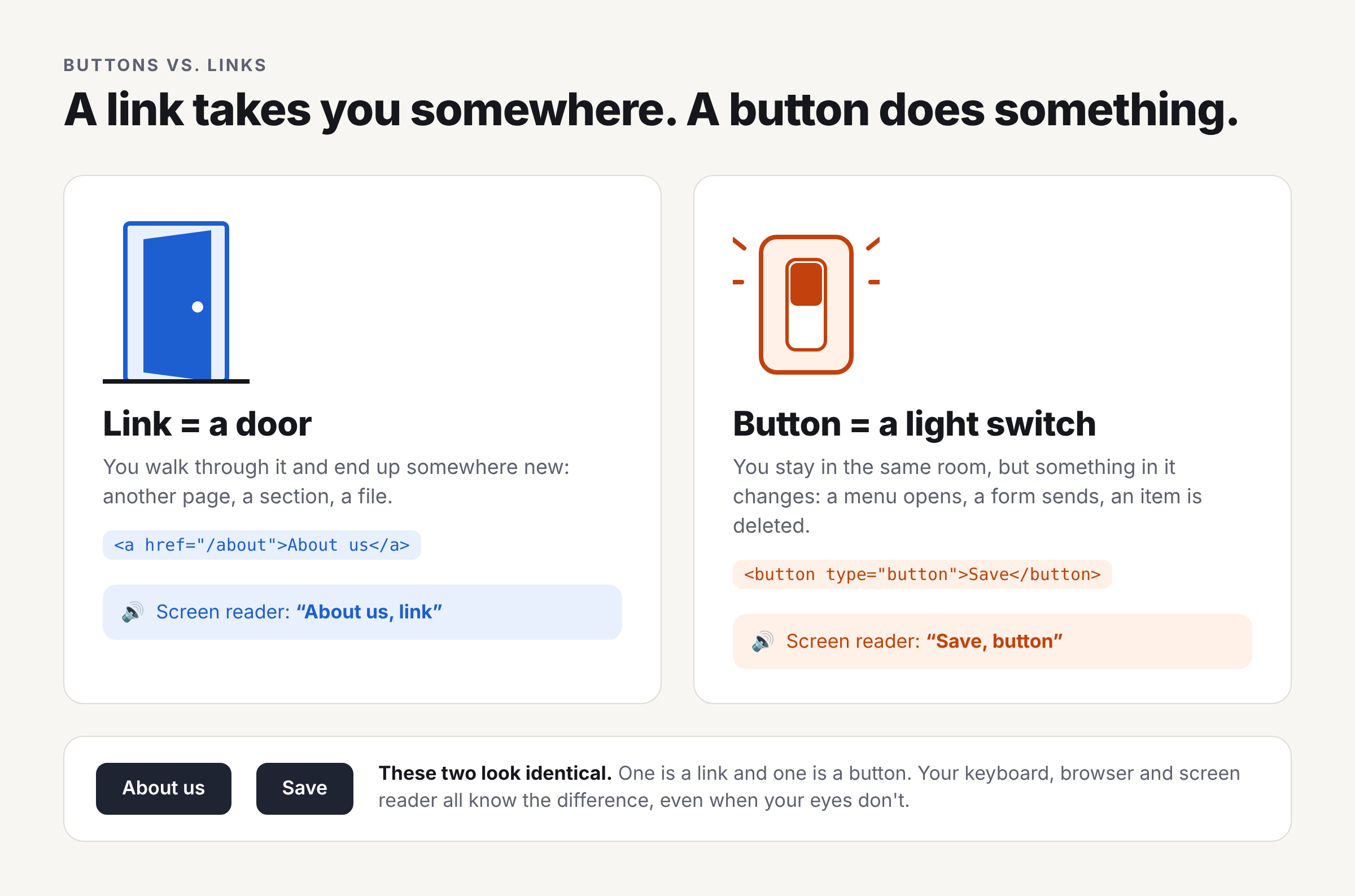 Figure 1. Door vs. light switch. Two elements can look identical while the browser and assistive tech treat them completely differently.
How to read this guide
- New to this concept? Read the main part of each section. It uses plain language and small examples. You can skip anything labelled Going deeper.
- Already shipping UI? Each section ends with a Going deeper part: the edge cases, specs and trade-offs worth knowing as an intermediate developer. The last two topic sections, on concerns beyond accessibility and on component libraries, are mostly for you.
Going deeper sections (7)
Words you’ll see
| Term | What it means in plain English |
|---|---|
| HTML element | A building block of a web page, written as a tag like <button> or <a>. |
| Semantic HTML | Using the element that means the right thing, not just one that looks right. A <button> means “I do something”; a <div> means nothing at all. |
| Screen reader | Software that reads the page out loud for people who are blind or have low vision. It announces each element’s type, like “Save, button”. |
| Focus | Which element the keyboard is currently “on”. Pressing Tab moves focus to the next interactive element. |
| Accessible name | The words a screen reader says for an element. Usually its visible text. |
| ARIA | Extra HTML attributes (aria-…) that describe things HTML can’t express on its own, like whether a menu is open. |
href | The address a link points to. Without it, <a> isn’t really a link. |
| WCAG | The Web Content Accessibility Guidelines: the international standard for accessible websites. |
The core rule
Ask yourself one question: after I click this, did I go somewhere (navigation), or did something happen ( action)?
- Somewhere new (another page, another part of this page, a file) → use a link:
<a href="/about">About us</a> - Something happened here (form sent, menu opened, item saved) → use a button:
<button type="button">Save</button>
A quick test: would it make sense to open this in a new tab or bookmark it? If yes, it’s a link. You can’t bookmark “Save”.
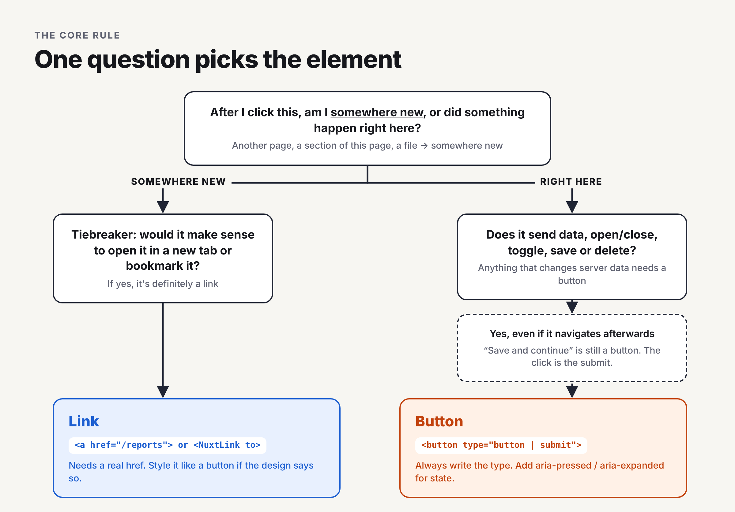 Figure 2. The core rule as a flowchart. Readers who skim will often stop here, so it carries the whole article in one picture.
What you get for free by choosing correctly
| What is happens | Link | Button |
|---|---|---|
| Screen reader says | “About us, link” | “Save, button” |
| Activate with the keyboard | Enter | Enter or Space |
| Right-click menu | Open in new tab, copy link | Nothing special |
| Browser Back button | Takes you back | Not involved |
| Works if JavaScript fails | Yes | Only inside a form |
You don’t have to write any code for these. The browser should give them to you, as long as you use the correct element.
Going deeper: why the browser treats them differently
- Implicit ARIA roles.
<a href>maps torole="link"and<button>torole="button"in the accessibility tree. Remove thehrefand an<a>has no role (it’s “generic”) and drops out of the tab order. - Activation behavior. The HTML spec gives each element its own activation behavior. Links navigate while buttons run their form-owner behavior (submit/reset/etc). That’s why Space activates buttons but scrolls the page on a link.
- Navigation is a browser feature, not your code. A real link participates in history,
:visited, prefetch, link-hover status text, modifier-key clicks and “open in new tab”. A click handler that callslocation.href = …orrouter.push()reimplements one sliver of that. - The mental model screen reader users rely on. Users pick their keyboard command based on the announced role. Mismatches cost them time even when the action still technically works.
Types of buttons
All buttons “do something” or perform an action, but they do different kinds of things. Here are the ones you’ll use the most:
| Type | Everyday example | What it does |
|---|---|---|
| Action | Save, Copy, Retry | Does one thing, once. |
| Submit | Sign in, Place order | Sends a form. |
| Toggle | Mute, Bold, Favorite | Switches something on or off. |
| Show/hide | “Show more”, accordion headers | Reveals or hides content. |
| Menu | The ⋯ “more options” button | Opens a list of actions. |
| Dialog | “Edit profile” | Opens a pop-up window/modal. |
| Icon-only | × close, ▶ play | Same as the others, but shows only an icon. |
| Destructive | Delete, Remove | Does something that’s hard to undo. |
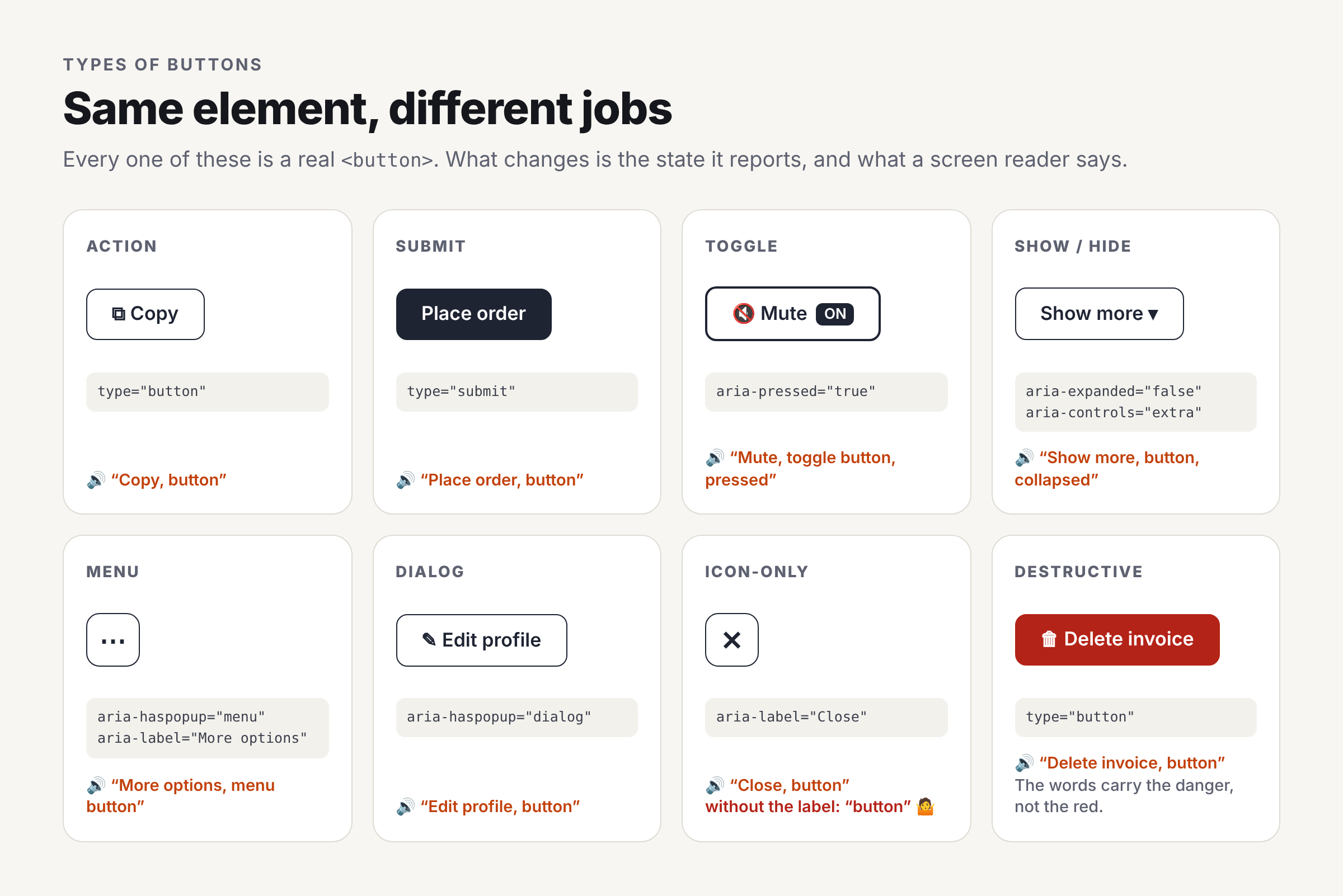 Figure 3. Every one of these is a
<button>. The attributes change what a screen reader announces.
Common habits that prevent most button bugs
- Always write the type. A button inside a form submits the form by default. Write
type="button"unless you really meantype="submit". - Give icon-only buttons a name. A screen reader can’t describe a picture of an ×. Add hidden text or
aria-label="Close". - Say what will happen. “Delete invoice” beats “OK”. Don’t rely on a branding colors to signal button purpose.
Looks are not types
“Primary”, “secondary”, “ghost” and “text” are just styles. A link can wear a primary-button style and still be a link. Choose the element by behavior, then pick the style.
Going deeper: types, states and disabling
- HTML
typevalues.submit(the default inside a<form>),button(no default behavior) andreset(clears the form, and is rarely worth the risk of lost work). A button outside a form can still submit one via theform="form-id"attribute. - State lives in ARIA.
- Toggle:
aria-pressed="true|false", with a constant label (“Mute”, not “Mute”/“Unmute”). Changing both the label and the state double-signals and confuses users. - Disclosure:
aria-expandedplusaria-controlspointing at the region. - Menu button:
aria-haspopup="menu"+aria-expanded, and the menu itself must implement arrow-key navigation per the ARIA Authoring Practices menu pattern. - Dialog trigger: move focus into the dialog on open, trap it there, and return it to the trigger on close. Native
<dialog>withshowModal()handles most of this.
- Toggle:
disabledvsaria-disabled. Nativedisabledremoves the button from the tab order and blocks events, so keyboard and screen reader users may never discover it or learn why it’s off.aria-disabled="true"keeps it focusable and announced; you block activation in code and can explain the reason. For form submit buttons, many teams prefer leaving them enabled and showing validation errors instead.- Loading states. Keep the button’s width stable, set
aria-busy="true"or announce progress via anaria-liveregion, and guard against double submission. - Split buttons are two buttons (the action and the menu trigger), each needing its own accessible name.
Types of links
Every link needs an href, the address it goes to. The rest is about where it goes.
| Kind | Example | Beginner tip |
|---|---|---|
| Page on your site | <a href="/settings">Settings</a> | The most common kind |
| Section of this page | <a href="#pricing">Pricing</a> | Jumps down to the element with id="pricing" |
| Skip link | <a href="#main">Skip to content</a> | Lets keyboard users jump past the menu; put it first on the page |
| Another website | <a href="https://vuejs.org">Vue docs</a> | Let people know they’re leaving your site |
| New tab | <a href="…" target="_blank"> | Use rarely, and say so (“opens in new tab”) |
| File download | <a href="/report.pdf" download> | Mention type and size: “Report (PDF, 2 MB)” |
| Email / phone | <a href="mailto:help@example.com"> | Show the address or number too, so people can copy it |
Write link text that makes sense on its own
Screen reader users often jump through a page link by link, hearing only the link text. Imagine hearing “click here, click here, read more”. So writing descriptive link text like “Read more about cleaning schedules” instead of “Read more” or “Click here”, link the words that describe the destination.
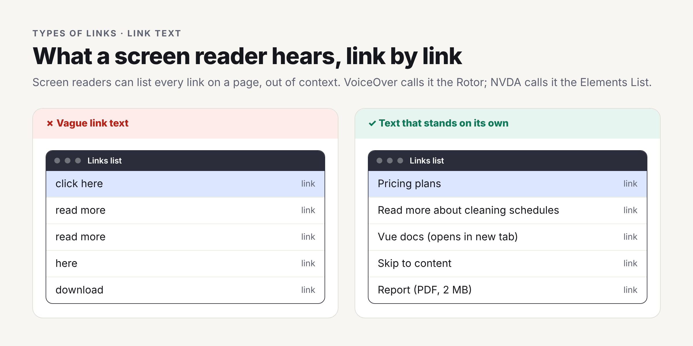 Figure 4. Link text heard out of context, the way screen reader users often browse a page.
Going deeper: links in real apps
- Router links.
<RouterLink>and<NuxtLink>render a real<a href>and intercept the click for client-side navigation. You keep every native link behavior and get SPA speed.NuxtLinkalso decides internal vs external for you and prefetches route chunks. - Current page. Mark the active nav item with
aria-current="page"(router links can add this automatically). Don’t rely on bold or color alone. - In-page anchors and focus. Browsers move scroll position, and modern ones move the focus starting point, to the target. If the target is a non-interactive element and focus doesn’t follow in your setup, add
tabindex="-1"to it. With sticky headers, setscroll-margin-topso the target isn’t hidden. target="_blank"andrel. Modern browsers implyrel="noopener"for_blank, which blocks the new page from controlling yours viawindow.opener. Addnoreferrerif you don’t want to leak the referring URL. Announce the new tab in text or with an icon that has a text alternative (WCAG 3.2.5 is AAA, but the courtesy matters).downloadonly works for same-origin URLs (orblob:/data:); cross-origin it falls back to normal navigation. The server’sContent-Dispositionheader can override it.- Visible label vs
aria-label. If you addaria-label, it replaces the visible text for screen readers. Voice-control users speak what they see, so the accessible name must contain the visible words (WCAG 2.5.3, Label in Name). Visually hidden extra text is usually safer thanaria-labelon links.
Accessibility
Accessibility boils down to ensuring everyone can use your site however they use a computer. For buttons and links, the people most affected are:
- Keyboard users, who press Tab, Enter and Space instead of using a mouse.
- Screen reader users, who hear the page instead of seeing it.
- Voice-control users, who say “click Save” out loud.
- People with low vision or shaky hands, who need good contrast and big enough targets.
The good news: if you use real <button> and <a href> elements, most of this works automatically.
The beginner checklist
- You can reach it with the Tab key.
- You can see where focus is (an outline or ring appears).
- It works with Enter (and Space, for buttons).
- It has text a screen reader can say, even if only an icon is visible.
- Links look like links (underlines help a lot), not just a different color.
- It’s big enough to tap easily.
Try it now on any page you’ve built: put the mouse away and press Tab.
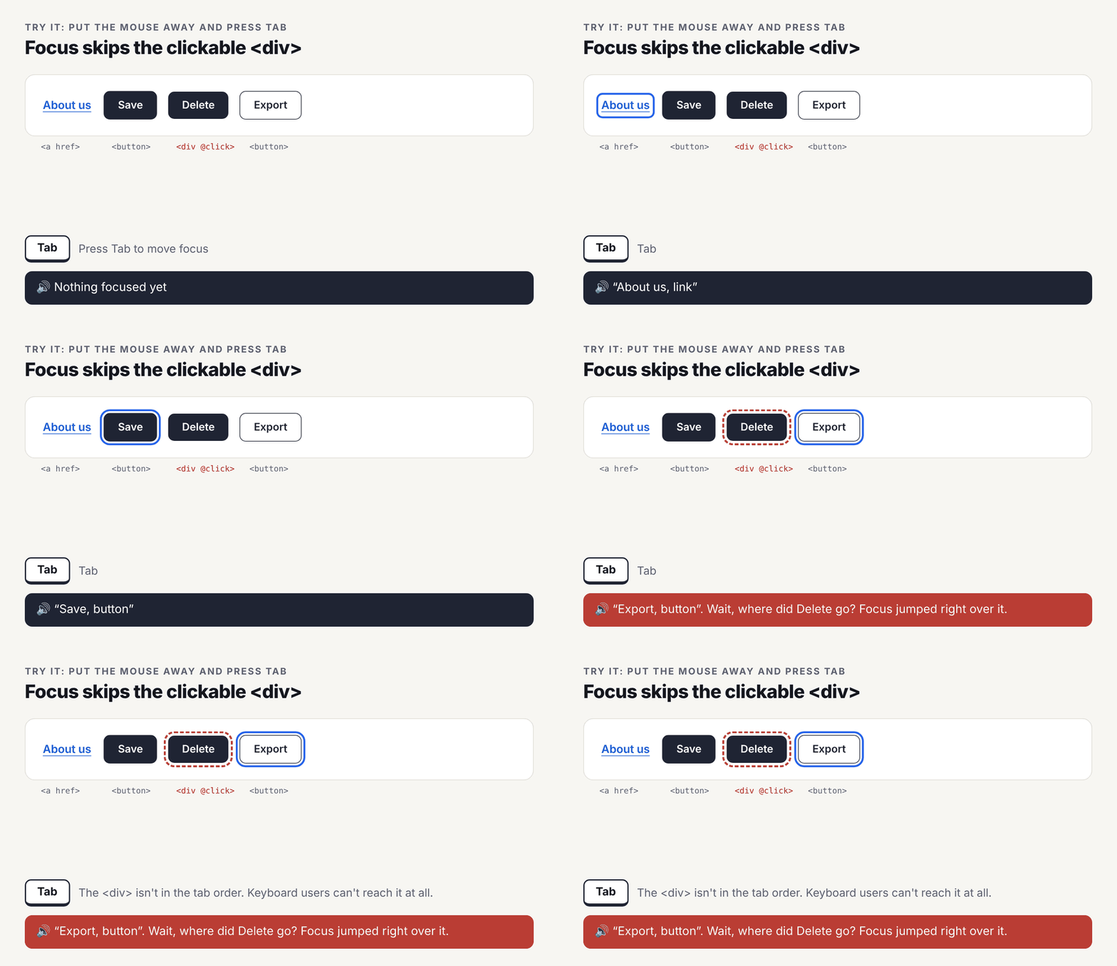 Figure 5 (animated). The Tab test in action. Focus jumps from Save to Export because the Delete
<div> isn’t in the tab order.
Going deeper: the specs behind the checklist
| WCAG 2.2 criterion | Level | What it requires here |
|---|---|---|
| 2.1.1 Keyboard | A | Every action reachable and operable by keyboard |
| 2.4.7 Focus Visible | AA | A visible focus indicator. Use :focus-visible instead of removing outline |
| 2.4.11 Focus Not Obscured (Minimum) | AA | Sticky headers/footers can’t fully hide the focused control |
| 2.4.4 Link Purpose (In Context) | A | Link text plus its context explains where it goes |
| 1.4.1 Use of Color | A | Inline links need a non-color cue (or 3:1 contrast with body text plus a cue on hover/focus) |
| 1.4.3 / 1.4.11 Contrast | AA | Text 4.5:1; control boundaries and focus rings 3:1 |
| 2.5.3 Label in Name | A | Accessible name contains the visible label |
| 2.5.8 Target Size (Minimum) | AA | At least 24×24 CSS px, or enough spacing around smaller targets |
| 4.1.2 Name, Role, Value | A | Correct role, a name, and exposed state (pressed, expanded) |
- How the accessible name is computed. In order of precedence:
aria-labelledby, thenaria-label, then the element’s content (text, plusalton images inside it), thentitleas a last resort. Know this order when debugging “why does it say that?” in the browser’s accessibility tree panel. - The first rule of ARIA: don’t use ARIA if a native element does the job.
role="button"on a<div>changes the announcement but not the behavior: you then owetabindex="0", Enter and Space handling, and disabled handling. Use ARIA for state (aria-pressed,aria-expanded,aria-current), not to turn one element into another. - Don’t nest interactive elements. A
<button>inside an<a>(or vice versa) is invalid HTML and announces unpredictably across screen readers. - Test with real tools. Keyboard only, then VoiceOver (macOS/iOS) or NVDA (Windows), plus an automated checker like axe. Automated tools catch roughly a third of issues; the role/behavior mismatch is often one they miss.
Common mistakes (and the fix)
Mistake 1: a clickable div. It looks fine with a mouse, but the keyboard can’t reach it and a screen reader doesn’t know it’s clickable.
<!-- ✗ Before -->
<div class="btn" @click="save">Save</div>

<!-- ✓ After -->
<button type="button" class="btn" @click="save">Save</button>
Mistake 2: a fake link that’s really a button. It’s announced as a link, adds # to the URL, and Space scrolls the page instead of activating it.
<!-- ✗ Before -->
<a href="#" @click.prevent="openMenu">Options</a>
<!-- ✓ After -->
<button type="button" @click="openMenu">Options</button>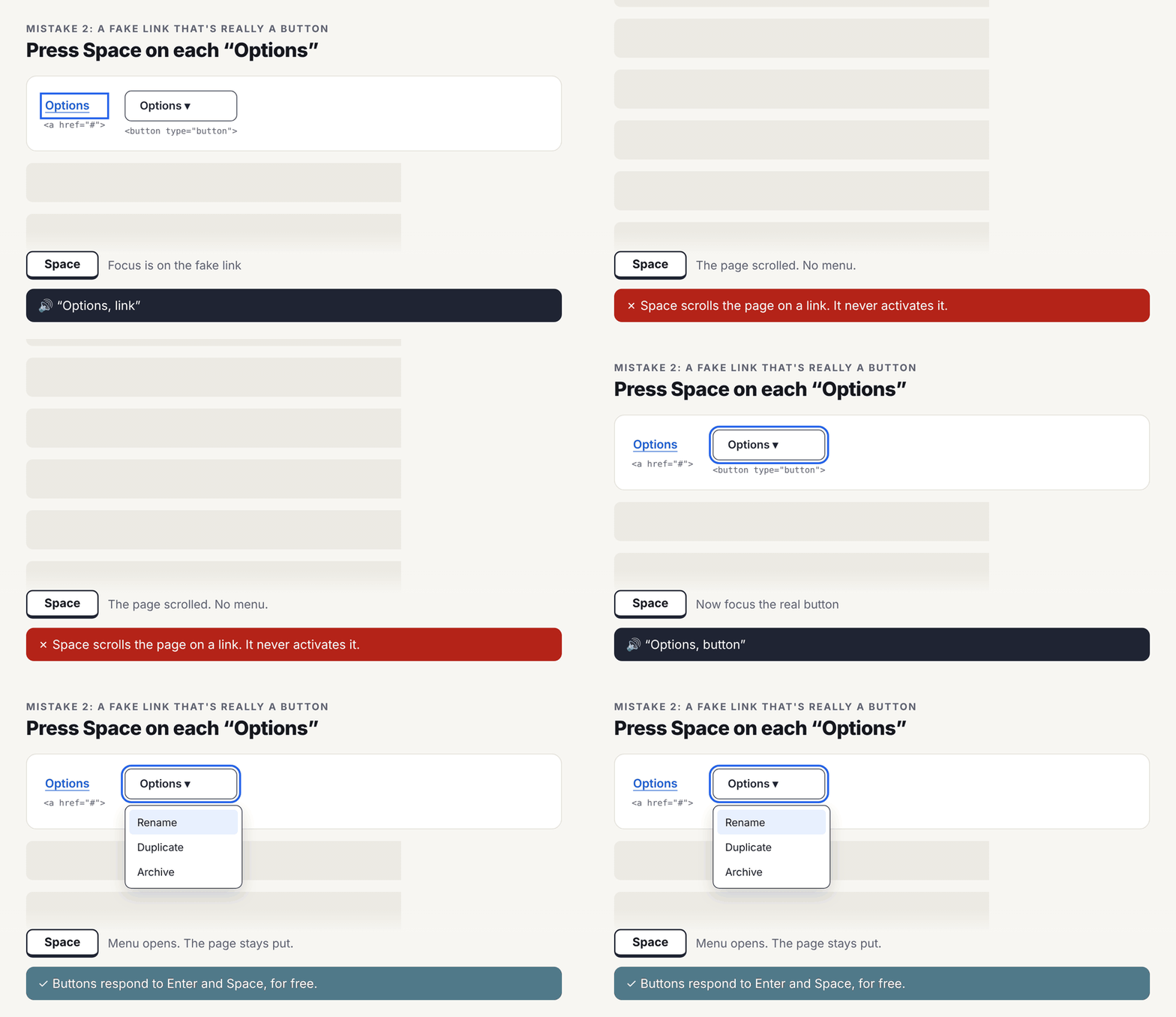 Figure 6 (animated). Mistake 2, live. Space scrolls the page on a fake link but opens the menu on a real button.
Mistake 3: a button that’s really a link. It goes to a new page, but you can’t open it in a new tab, copy it, or rely on the Back button.
<!-- ✗ Before -->
<button @click="router.push('/reports')">Reports</button>

<!-- ✓ After -->
<NuxtLink to="/reports" class="btn">Reports</NuxtLink>
Mistake 4: a button inside a link (or a link inside a button). Pick one element and style it however you like.
Mistake 5: a form button with no type. Clicking “Cancel” submits the form, because submit is the default.
Going deeper: the gray areas
- A “Sign up” call-to-action styled as a big button. If it goes to
/signup, it’s a link with button styling. That’s correct. Style follows design; element follows behavior. - Submit, then redirect. “Save and continue” sends data and then navigates. The user’s action is the submit, so it’s a button. The navigation is a consequence.
- Tabs. If each tab swaps a panel in place, it’s the ARIA tabs widget (
tablist/tab/tabpanelroles, arrow-key navigation). If each “tab” is its own URL, it’s a<nav>of links witharia-current="page". - Pagination, sorting and filters. If they update the URL (and they usually should, so results are shareable and Back works), they’re links. If they’re purely local UI state, they’re buttons.
- Whole-card click targets. Don’t wrap the entire card in
<a>: the link name becomes the whole card’s text, and nested buttons become invalid. Put the link on the heading and stretch its hit area with a::afterpseudo-element positioned over the card. - Logout and other state changes. Logging out changes server state, so a form POST behind a button is more correct than a GET link. Prefetchers and crawlers can follow links without a human clicking.
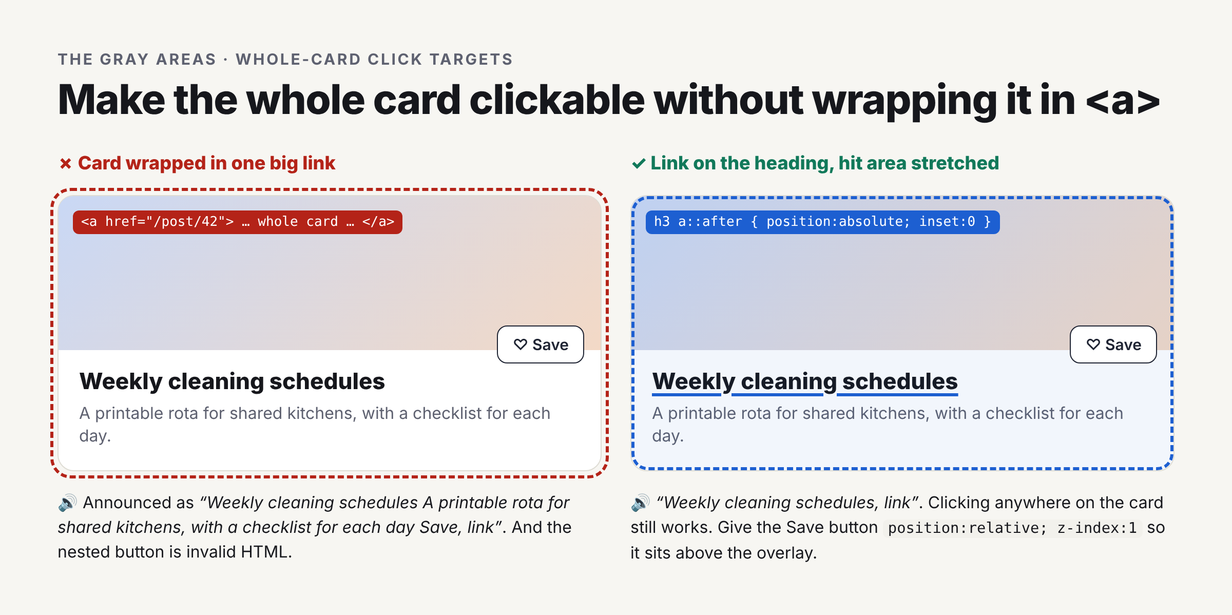 Figure 7. The whole-card click target, done two ways.
Beyond accessibility
Choosing correctly also affects search engines, security and speed. In short: real links help Google find your pages, and buttons keep risky actions from firing by accident.
Going deeper: the other costs of getting it wrong
- SEO and crawlability. Crawlers follow
<a href>. They don’t click buttons or run click handlers, so navigation hidden behindrouter.push()on a button is invisible to search engines and link-preview bots. - Browser features users expect. Links get middle-click, Cmd/Ctrl-click, drag-to-bookmark, copy link address, hover URL preview,
:visitedand Back. Fake links lose all of it, and users feel it even if they can’t name it. - HTTP semantics and security. Links issue GET requests, which must be safe and repeatable. Anything that changes data belongs behind a button and a POST/PUT/PATCH/DELETE. A “Delete” link can be triggered by a prefetcher, a browser extension or a malicious
<img src>(a CSRF vector) without anyone clicking. - Performance.
<NuxtLink>and<RouterLink>prefetch route chunks when they enter the viewport or on hover. A button callingrouter.push()gets none of that, so the navigation feels slower. - Analytics. Name events by intent (
signup_started), not by element (button_click), so swapping a button for a link doesn’t break dashboards. - Testing. Query by role in tests (
getByRole('link', { name: 'Reports' })in Testing Library, Playwright or Vitest browser mode). If the test can’t find it by role, neither can a screen reader. This turns semantics into something CI enforces.
Building it into a component library
If your team has a shared <BaseButton> component, it should be able to render as either a button or a link, with the same look. Then nobody is tempted to use the wrong element just to get the right style.
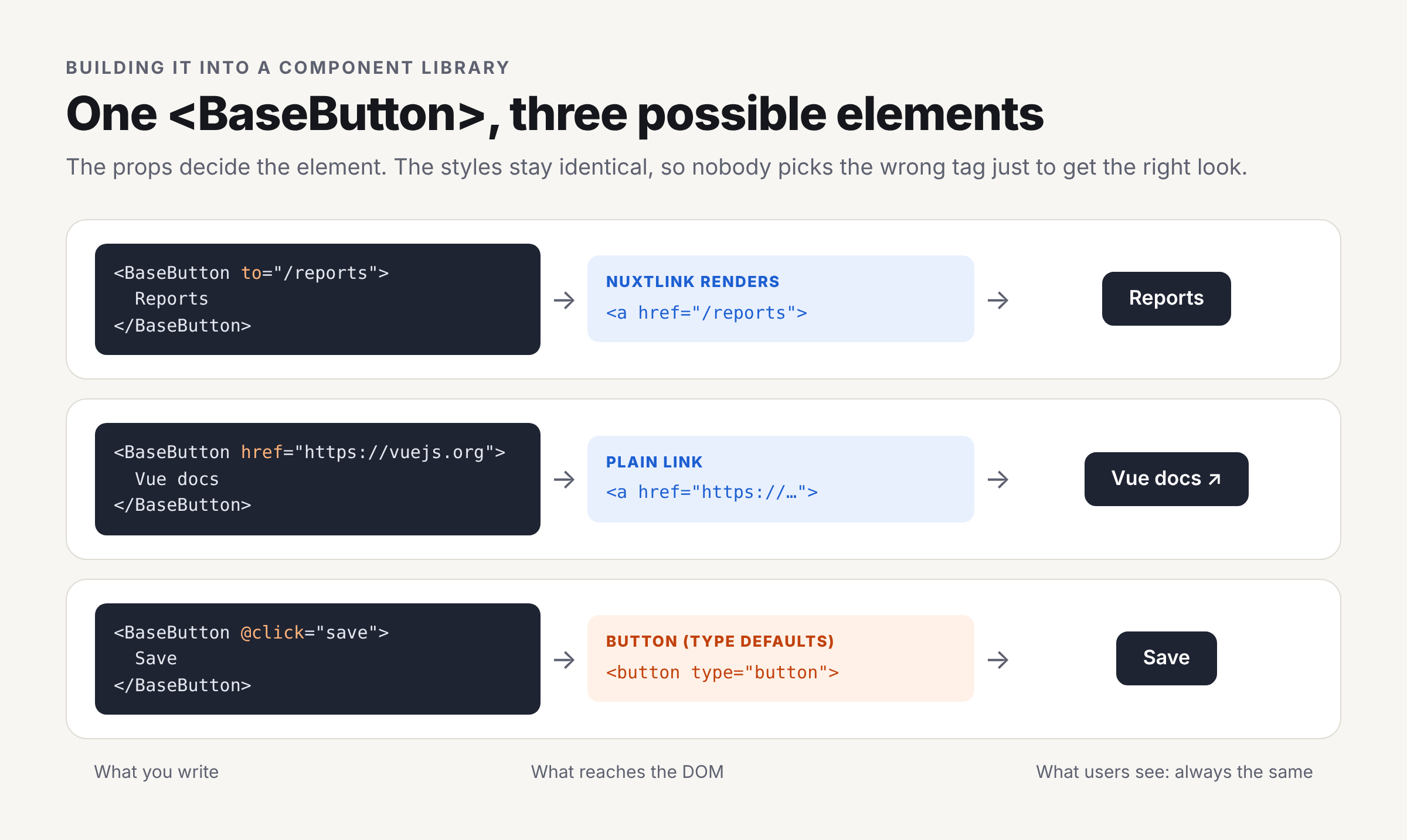 Figure 8. One component, three possible elements, identical styling.
Going deeper: a polymorphic button in Vue/Nuxt
The component picks the element from its props: to means a router link, href means a plain link, and neither means a button.
<script setup lang="ts">
import { computed } from 'vue'
import type { RouteLocationRaw } from 'vue-router'
import { NuxtLink } from '#components'

const props = withDefaults(defineProps<{
  to?: RouteLocationRaw
  href?: string
  type?: 'button' | 'submit' | 'reset'
  variant?: 'primary' | 'secondary' | 'ghost'
}>(), { type: 'button', variant: 'primary' })

const isButton = computed(() => !props.to && !props.href)
const tag = computed(() => props.to ? NuxtLink : props.href ? 'a' : 'button')
</script>

<template>
  <component
    :is="tag"
    :to="to"
    :href="href"
    :type="isButton ? type : undefined"
    :class="['btn', `btn--${variant}`]"
  >
    <slot />
  </component>
</template>
Rules that keep it honest:
- Default
typeto"button". Never inherit the browser’s submit default by accident. - Only pass button-only attributes to buttons.
type,disabled,aria-pressedandaria-expandedare invalid or meaningless on<a>. - No disabled links. A link that goes nowhere shouldn’t be a link. Render text, or a button with
aria-disabled. - Make icon-only usage require a label. Use a TypeScript discriminated union so
iconOnly: truewithoutlabel: stringfails to compile. - One set of styles for both elements, including
:focus-visible,:hoverand a reset for the link underline, so styling never drives element choice. - Document the decision rule in the component’s docs page, with the “new tab” test, so consumers pick
to/hrefvs@clickcorrectly. - Lint for it.
eslint-plugin-vuejs-accessibilityflags clickable non-interactive elements and missing labels. Add role-based component tests (see the testing note above).
Quick checklist
- Does it take you somewhere new (page, section, file)? → Link with a real
href. - Does it do something right here (send, open, toggle, save, delete)? → Button with an explicit
type. - Would someone want to open it in a new tab? → Link.
- Does it change data on the server? → Button.
- Does it switch something on/off or open/closed? → Button, plus
aria-pressedoraria-expanded. - Is it only an icon? → Give it a name a screen reader can say.
- Does it need to look like the other one? → Change the CSS, never the element.
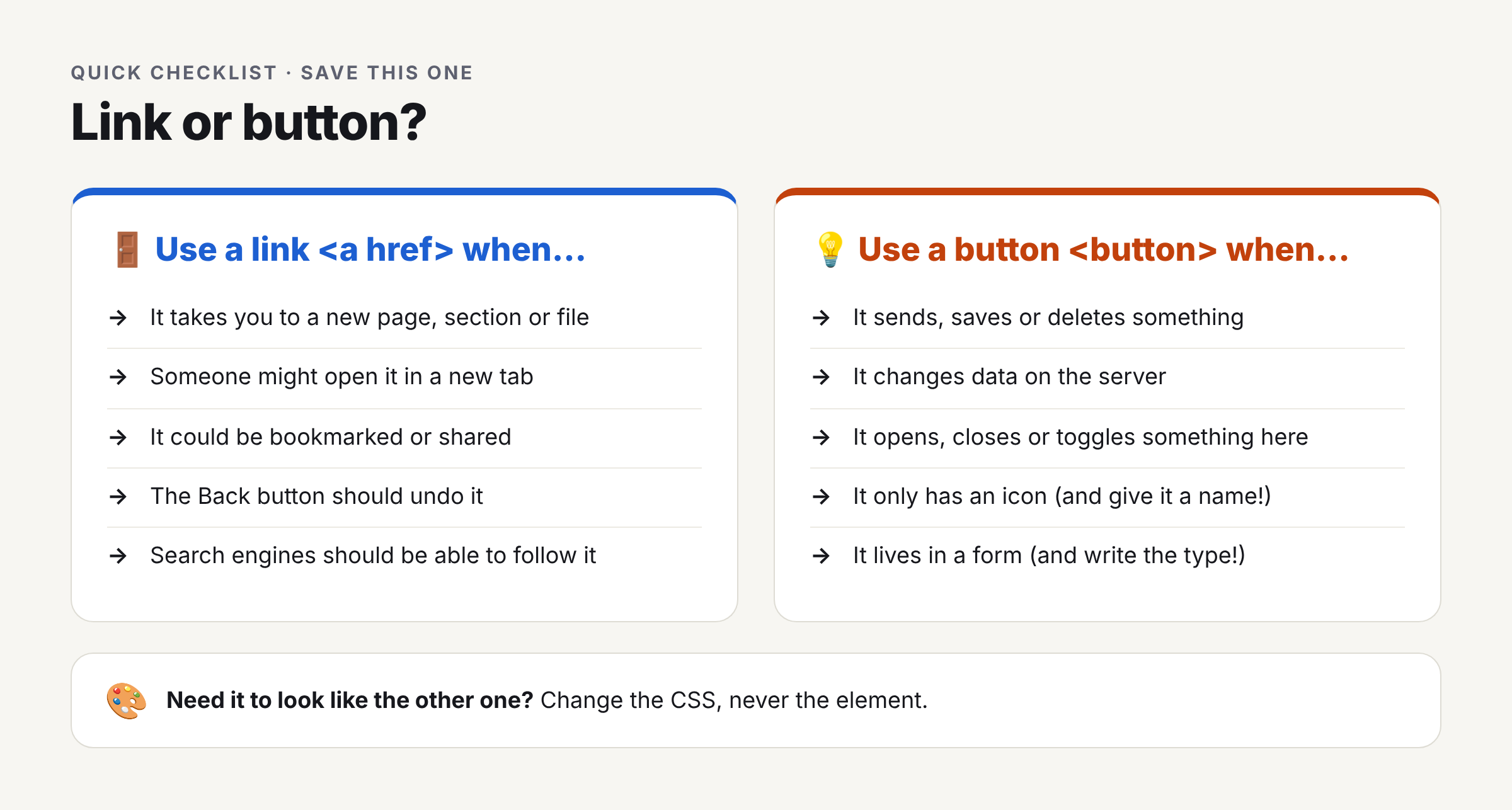 Figure 9. The checklist as a single image, sized for social sharing or a printable cheat sheet.
Further reading (pick your rabbit hole)
| If you want to go deeper on… | Read |
|---|---|
| The button element and its attributes | MDN: <button> |
| The link element and its attributes | MDN: <a> |
| Toggle, menu and disclosure button patterns | WAI-ARIA Authoring Practices: Button |
| Link patterns | WAI-ARIA Authoring Practices: Link |
| Every accessibility criterion referenced here | WCAG 2.2 |
| How accessible names are calculated | Accessible Name and Description Computation |
| When (not) to use ARIA | Using ARIA |